ERP dashboards
An ERP dashboard should start the work
Most of them report on it. These are real screens from Onfinity, where the figure, the exception and the button that deals with it sit on the same tile.
See them with your data Look at the examplesDashboard or report
A number you can act on, or a number you write down
Most ERP dashboards are reports with rounded corners. They tell you that fifty-nine invoices are pending, and then you go and find them. A dashboard earns its space when the thing you would do next is on the same tile as the number that made you want to do it.
From the shipping product
Six dashboards, one job each
Not mock-ups. These are the screens people open in the morning.
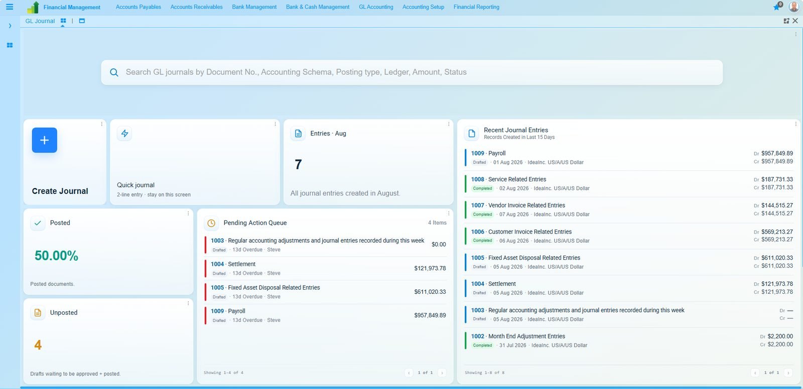
Posted against unposted as a percentage rather than a count. A queue of what is waiting, how overdue it is and who owns it. The journal entries themselves, with both sides of each one. Nothing here needs a second screen to become useful.
Maintenance CNC Lathe MachineAssembly WC-1 06 Jan 2026Convert →
Maintenance CNC Lathe MachineAssembly WC-2 15 Dec 2025Convert →
Maintenance Diesel Generators 900 KVAESS North L1 24 Oct 2024Convert →
Field service
Open and overdue, split before you look
The asset and the location are already on the row, and Convert turns a breakdown into a work order without opening anything.
| Invoice | Customer | Status | Amount |
|---|---|---|---|
| 100123 | Northbank Motors | Due soon | $5,250.00 |
| 100121 | Bell Stationery | Due soon | $22,500.00 |
| 100119 | Harrow Freight Ltd | Overdue | $18,400.00 |
| 100118 | Vantage Components | Overdue | $9,875.00 |
| 100117 | Meridian Packaging | Overdue | $3,120.00 |
Accounts payable
The exception is the headline
A suspected duplicate sits above the list rather than inside it, because it is the one thing on this screen that costs money if it is missed.
Purchasing
Length of bar means length of wait
The bars are scaled against the oldest receipt, so the row that has been sitting longest is the longest bar. Sorted, not just listed.
HR and recruitment
The funnel, next to the headline number
Seven days to hire means little on its own. Beside the stage conversions it shows where the seven days are going.
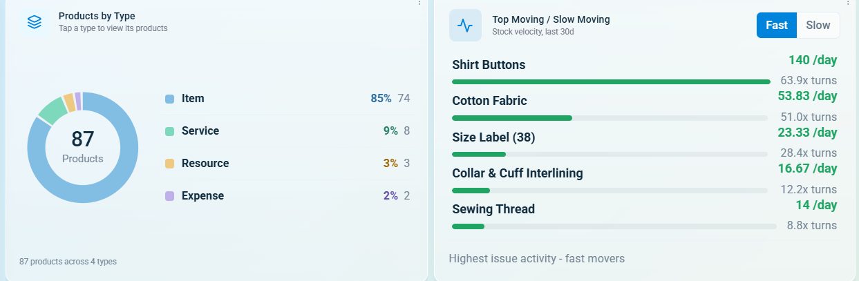
Two widgets side by side. The mix on the left is context; the velocity on the right is the decision. Turns per item rather than a total, because a total tells you nothing about which line to reorder.
ERP dashboard design
Six rules these are built on
Whatever system you are designing for, these are the ones that decide whether a dashboard gets opened twice.
Put the action on the tile
If the number matters, the thing you do about it belongs beside it. Convert, review, approve, chase. A figure with no verb next to it is a report.
Surface the exception
Nobody scans a list for the one wrong row. The duplicate invoice, the blocked payroll item, the order short of material: those go above the list, not in it.
One click to the record
Every figure should open the rows behind it. A number nobody can drill into gets checked in the ledger anyway, which is the whole cost you were avoiding.
Live tables, not last night
A dashboard fed by an overnight extract is a dashboard people quietly stop trusting. Read the same tables the transactions write to.
Shape it to a role
A payables clerk and a finance director need different screens. One dashboard for the whole company is a dashboard for nobody in particular.
Make the bar mean something
Scale bars against a real maximum, so length carries information. A bar that does not track its own number is decoration with a tooltip.
Your own dashboards
Every widget here is a dictionary entry
Onfinity describes every window, field and process in an application dictionary the software reads at runtime. A dashboard widget is described the same way, so adding one is configuration rather than a development project. Onfinity Canvas builds them, and AURA drafts them from how a team already works.
How Canvas works Business intelligenceSee these with your own numbers
Thirty minutes on your data model. Bring the report somebody rebuilds in a spreadsheet every Monday and we will put it on a screen instead.
Book a demo Download the free edition